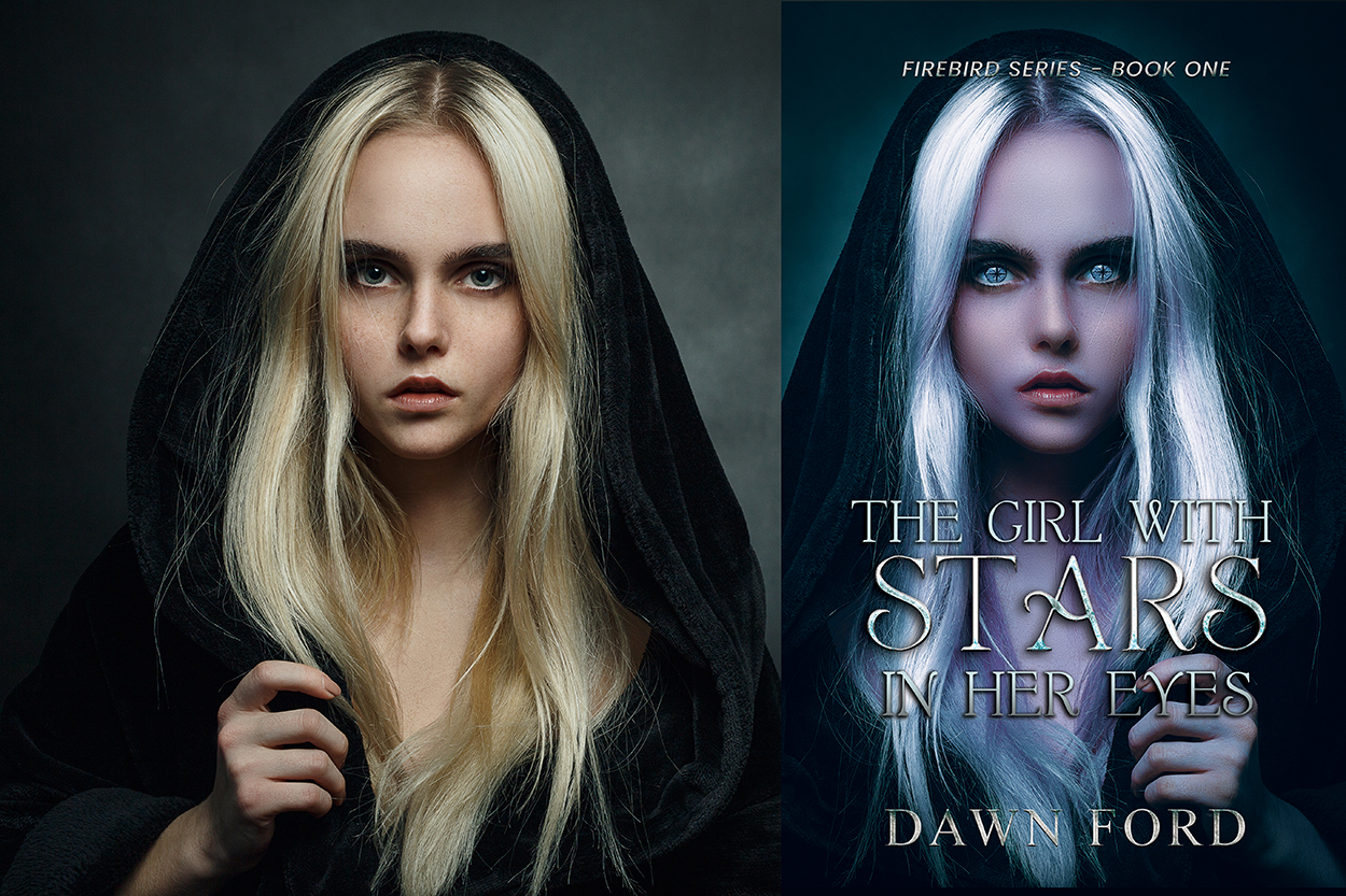
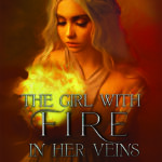
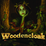
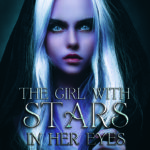
 This morning, I received an email from Clean Fiction Magazine informing me that one of our books, The Girl with Stars in Her Eyes by Dawn Ford, had won second-place in their Autumn 2022 Cover Art Contest. That’s pretty exciting, especially since this was basically a “readers’ choice” type of award, with the winners selected by votes.
Designing a book cover is a process. It starts with the author’s idea of what he/she wants her book cover to look like. Some publishers don’t allow authors to give much input into the cover’s design. I’ve have friends published by big publishing houses who were allowed to answer a few questions (character appearance, setting description, etc.), and later received an email with the final design that basically said, “Here’s your cover!” Sometimes those emails are of the read-’em-and-weep nature. One author friend’s cover had a glaring error–a cowboy whose belt buckle wording was upside down. The mistake was discovered too late, because the print run was processed before she even saw the final design!
At Scrivenings Press, we give authors a detailed questionnaire to help with designing the cover. Although the final cover selection is ultimately my decision as the graphic designer and owner/publisher, I want our authors to love their covers and be proud of them. So, I do my best to transform their questionnaire responses into a cover that hopefully represents their story well.
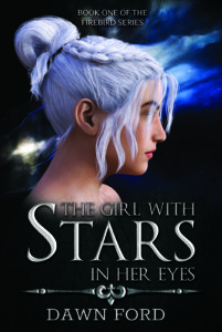
Tambrynn, the main character in The Girl with Stars in Her Eyes has a unique appearance. Obviously, her eyes have stars. And, her hair is silver. After completing the character description section of the questionnaire, author Dawn Ford responded to the next section “Your Ideas for Cover” with the following suggestions:
-
- Tambrynn stepping into the passage doorway. Lucas would not need to be there, but it would be ideal to have him there.
- Side views of Tambrynn and Lucas with Lucas in his bird form.
- A closeup of Tambrynn’s face, but not showing her eyes necessarily since that’s difficult to do, with Lucas beside her.
- Tambrynn walking in a dark forest with her arm raised allowing Lucas in his bird form to land on her arm or shoulder.
- Tambrynn standing with her hands lit up with magic, ready for battle.
Hmm …
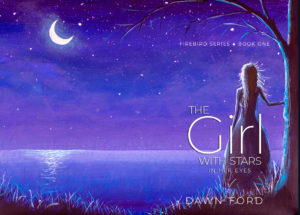
I knew this was a fantasy book–a “twisted fairytale”– and by this point, I had read the manuscript, which is helpful when making the cover. (Sometimes the publishing workflow requires me to design the cover before I’ve had a chance to read the story.) As Dawn mentioned, showing Tambrynn’s face could be difficult. And, the early drafts of the cover hid her face. (Click on the images in this post for a larger view.)
But her face was exactly what I wanted to capture. I wanted potential readers to see the young woman who is the driving force behind this amazing story, not hide her with a silhouette or side view. Because I’d read Tambrynn’s tale, I’d developed a mental image of her. She is tough in many ways, but beautiful. Fearful but strong. Lonely. And, as she will soon discover, powerful. There’s also a haunting about her that I wanted to show.
 So, I looked for more possibilities. Finding a useable book cover image isn’t as simple as typing “silver-haired girl” into Google and plopping a picture into a photoshop document. First, an image must be of high enough quality to be used on a print product. Then, it must be licensable. Without the legal rights to use a photo, it’s well, useless. In fact, early in the process of this cover, I found a pic I liked. It was a “free download” from one of those fantasy wallpaper sites. But nowhere could I find the capability to purchase a royalty-free license for a book cover.
Next …
And then, I found her. The haunting look. The long, flowing hair. The strength. The wariness. Even the hood she was wearing would work with the genre.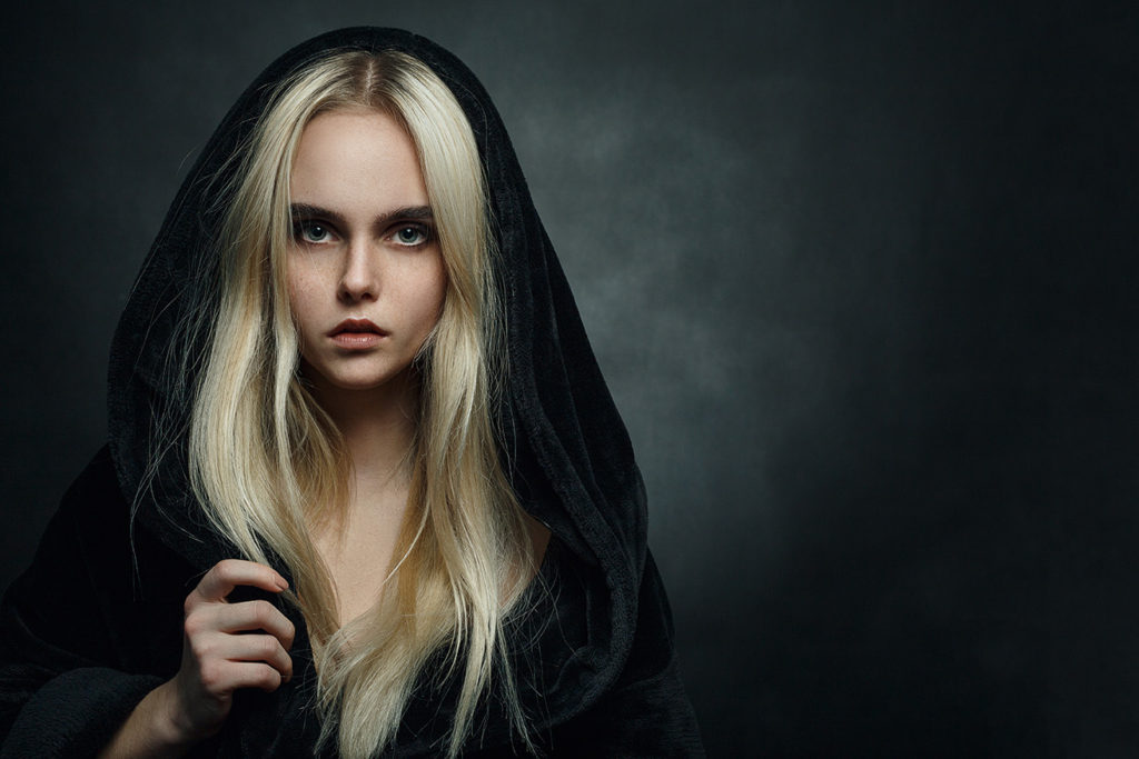
But … her hair was not silver. Her eyes, of course, did not have stars. And, in all honesty, the model, whose skin was a bit freckled and splotchy, didn’t possess that classic beauty of a fairytale heroine. Plus, the photo may have been shot with a sepia filter, because the girl’s face had a yellowish, almost jaundiced, appearance.
All she needed was a Photoshop Spa Day to transform her into Tambrynn.
Photoshop is my happy place. I don’t consider myself an expert by any stretch, but I am pretty handy. I’ve watched a ton of tutorials, I enjoy learning new techniques, and I’m always up for a challenge (a closeup of Tambrynn’s face, but not showing her eyes necessarily since that’s difficult …). I’m also pretty stubborn.
Changing the hue from yellow (ew!) to blue was the easy part. And her hair. Again, not too difficult. Going from dark hair to light can be a problem, but blonde to silver wasn’t too hard. I flipped the photo horizontally so it would center well on the front cover and used some magazine designer tricks to soften and smooth her skin, add “makeup,” and give her an almost porcelain, fairytale-princess face.
Now it was time to tackle the eyes. Stars in her eyes. Stars? In her eyes. Seriously? And since the stars-in-the-eyes thing is actually mentioned in the title, there’s no fudging on it. I’ve changed eye color numerous times. But adding star-shaped pupils was a first. Back to searching images …
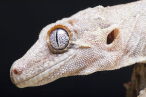 So, who, or what, has eyes that might work? Dragons? Snakes? LIZARDS? Yes, lizards. Tambrynn’s pupils were originally from a stock image of a lizard.
Covering or replacing a model’s pupils can be a bit tricky. This is where being stubborn is helpful. Size, shape, angle … all must be adjusted. And, the star-like pupils themselves weren’t quite right. Dawn give me some input on this. I started with the simple up and down cross line lizard eyeball, and she suggested (even sent me a mockup) adding another cross bar. Viola! The eyeball was ready. Except for a bit of colorization. No biggie, there.
Finally–font time!
I’m a self-proclaimed fontaholic. I have over four thousand fonts (4,334, to be exact) in the FONTS folder of my external hard drive. Maybe that’s a bit excessive, but a font can literally make or break a book cover. This font (Garton) was a free font with a commercial use license. Some fonts are premium to be used on commercial products, and I’ve paid for many fonts, if it’s the right one for the project. I got lucky on this one.
Because this book is a fantasy novel, I wanted a bit of stylization to the font besides the go-to drop shadow. So, I kind of went over-kill on the effects, which include Bevel & Emboss, Inner Glow, Satin, Gradient Overlay, Pattern Overlay, and, of course, a Drop Shadow. Okay, that’s a LOT of effects slapped onto the font, but in the end, they all work together to give the title that metallic, medieval look.
Do I spend this much time on every cover? Not usually. But I always want to do what is necessary, within my limits of time, available resources (stock images & fonts), and Photoshop technical skills, to produce a cover that conveys the story and makes the author happy.























































































And that’s why it’s an award winner! Great post. We all appreciate the time and care you put into covers.
Thanks, Jenny! 🙂
I love hearing about your process here! It is a stunning cover. You do exceptional work!
Thank you! Working on your cover was a lot of fun, too. I love the way it turned out. 🙂
And I was absolutely thrilled with the end result. I still love it! It certainly captures attention at every event I go to and have had so many positive and gushing comments about Tambrynn’s cover. Thank you for all your hard work. It has paid off!
Thanks, Dawn! And I love the story. 🙂
How awesome! I never knew what the process was like. So creative!!
Thanks, Jen! 🙂
Loved reading this, so interesting! From the first time I saw this cover, I was impressed. Congratulations on the award!
Thanks so much!
Photoshop Spa Day 🤣 love it!! A beautiful cover and now that we know the process I see exactly why it earned a prize!!
😉 That just popped into my head. But it’s kind of true, right? lol
So interesting! I love “behind the scenes” info. It’s a fabulous cover! I voted for it! Congrats!!
Thanks so much for your comment and your vote, Pam!